
PRELIM
As a preliminary task I put together a magazine aimed at students who were thinking about joining Winstanley college. The magazine included the following things-
. The subjects there were to choose from
. An ofsted report
. How to get onto the Winstanley website
. Trips that the college provided
. A section on what the students think.


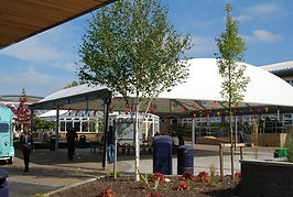


Before putting the magazine together I went round the college and took various images that could be included in my magazine. I tried to get a range of images that showed as much of the college as possible.
Front cover
This is the front cover of my preliminary task which was the create a magazine for Winstanley college aimed at students thinking of joining. I decided on the title "Winstanley write up by media and performing arts". However when putting my magazine together I only put "Winstanley write up by" as text and plaed it about a picture of the media entrance were it says "media and performing arts". This was therefore more creative than just putting it all in text which I thought therefore represented the creatvity that is assoicated with the college and media department. The colour scheme in terms of text was mostly blue as that is the colour of the college and was therefore the appropriate colour the use. I decided to use quite a humourous image as I thought it would be better to portray the college as quite an easy going and fun place, instead of the very scary and formal place that school students expect it to be. We made sure that the doors were open in the background to give the message that the doors are open to everyone as long as they are willing to be dedicated and passionate. I placed various text around the image of the two students which told the audience about the content within the magazine so they had an idea of what is was about. I also included a couple more images that linked to the text about the trips so it was clear what I meant.

Contents page
This is the contents page of my preliminary task. I tried to make this as simple as possible so that I didn't make anything harder for students than it already was. I tried to split the page equally in terms of how much of it was allocated to text and how much was given to images. In terms of what was included in my magazine I tried to think of everything that I wanted to know when looing at colleges and tried to inlcuded it. However I did not assume that I had added everything and therefore put an action point (phone number) on the page if there was anything else students wanted to ask. I then tried to pick some of the most relevant images out the ones that I took that would reflect the college and show students what they wanted to see. I went against taking pictures of just one department and tried to go around the college so that students were familiar with sights and places if they decided to come to the college. I also added the Winstanley logo in the top right hand corner of the page so that the magazine looked more professional. Also this may reassure students that this magazine comes straight from Winstanley college and hasn't been wrote by another source who may get their facts wrong.
